Find Your EnergyThe following information has been updated to reflect CSU's new Find Your Energy brand. Please note all colors in the previous CSU secondary and tertiary color palettes are considered retired and should not be used.
Brand Colors
Colorado State has two primary colors that represent our university and help it stand out in the collegiate landscape. Colorado State’s Primary Green should be heavily featured on any piece of collateral produced by the university.
Alongside the university’s Primary Green and Gold are Aggie Orange, 80% Black, and White, which not only nods to our heritage, but also adds flexibility.
The Energy Palette heightens Colorado State’s primary brand colors while creating a color system that is distinct and ownable. It is a refreshed palette of colors that reflects past iterations of the Colorado State palette but evolves it to a place that reflects the refreshed brand.
We urge all campus communicators and colleges to adopt this “secondary” palette as a way to remain connected with the university’s branding while creating a look and feel that is ownable for their college.
Please note all colors in previous CSU secondary and tertiary color palettes are considered retired and should not be used.
OVAL GREEN
R0 G97 B68 HEX #006144 C100 M17 Y84 K18 PMS 7726
LOVERS LANE
R130 G197 B3 HEX #82C503 C55 M0 Y100 K0 PMS 376
ENERGY GREEN
R207 G252 B0 HEX #CFFC00 C22 M0 Y93 K0 PMS 388
FLOWER TRIAL RED
R229 G106 B84 HEX #E56A54 C0 M72 Y72 K0 PMS 7416
POWERED PURPLE
R126 G84 B117 HEX #7E5475 C36 M62 Y4 K0 PMS 521
HORSETOOTH BLUE
R0 G143 B179 HEX #008FB3 C100 M20 Y30 K0 PMS 314
STALWART SLATE
R16 G84 B86 HEX #105456 C100 M16 Y42 K45 PMS 323
SUNSHINE
R255 G192 B56 HEX #FFC038 C0 M26 Y100 K0 PMS 143
Neutrals
Neutrals provide flexibility to the Colorado State palette. While these colors are not “officially” part of the Colorado State palette, they can be used in addition to it for balance, legibility, and accessibility.
BLACK
R0 G0 B0 HEX #000000 C40 M30 Y20 K100 PMS Black
GRAY
R204 G204 B204 HEX #CCCCCC C10 M7 Y8 K0 PMS N/A
TAN
R227 G205 B177 HEX #E3CDB1 C10 M17 Y30 K0 PMS N/A
Color Proportions
Color proportions are key to ensuring that while we incorporate secondary colors into brand work, anything made by the university still feels recognizable as Colorado State.
This is the preferred color proportion break down for all colors in the palette. While it is impossible to be exact with color proportions, this should serve as a basic guideline for using colors.
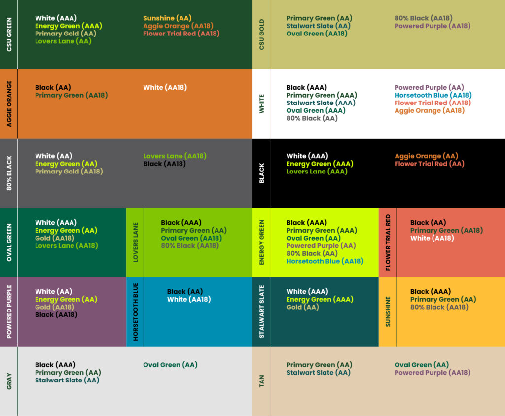
Color Pairings for Accessibility
Color accessibility is key to creating a brand that is welcoming to all regardless of abilities. Pairings of background colors and type colors ensure our messaging is legible. These are our preferred pairings of background color and type color. While other pairings not shown here may be accessible, they are not recommended for brand use.
If a pairing is labeled with AA18, it should be used at large type sizes only (we recommend 18pt regular or 14pt bold, but no smaller). AAA and AA pairings can be used at any type size.
If color pairings are not featured here, they are not approved for use by the university.